Piekarnia Ziarenko
Brand identity, Social Media
2024
Created in collaboration with Toucan Agency
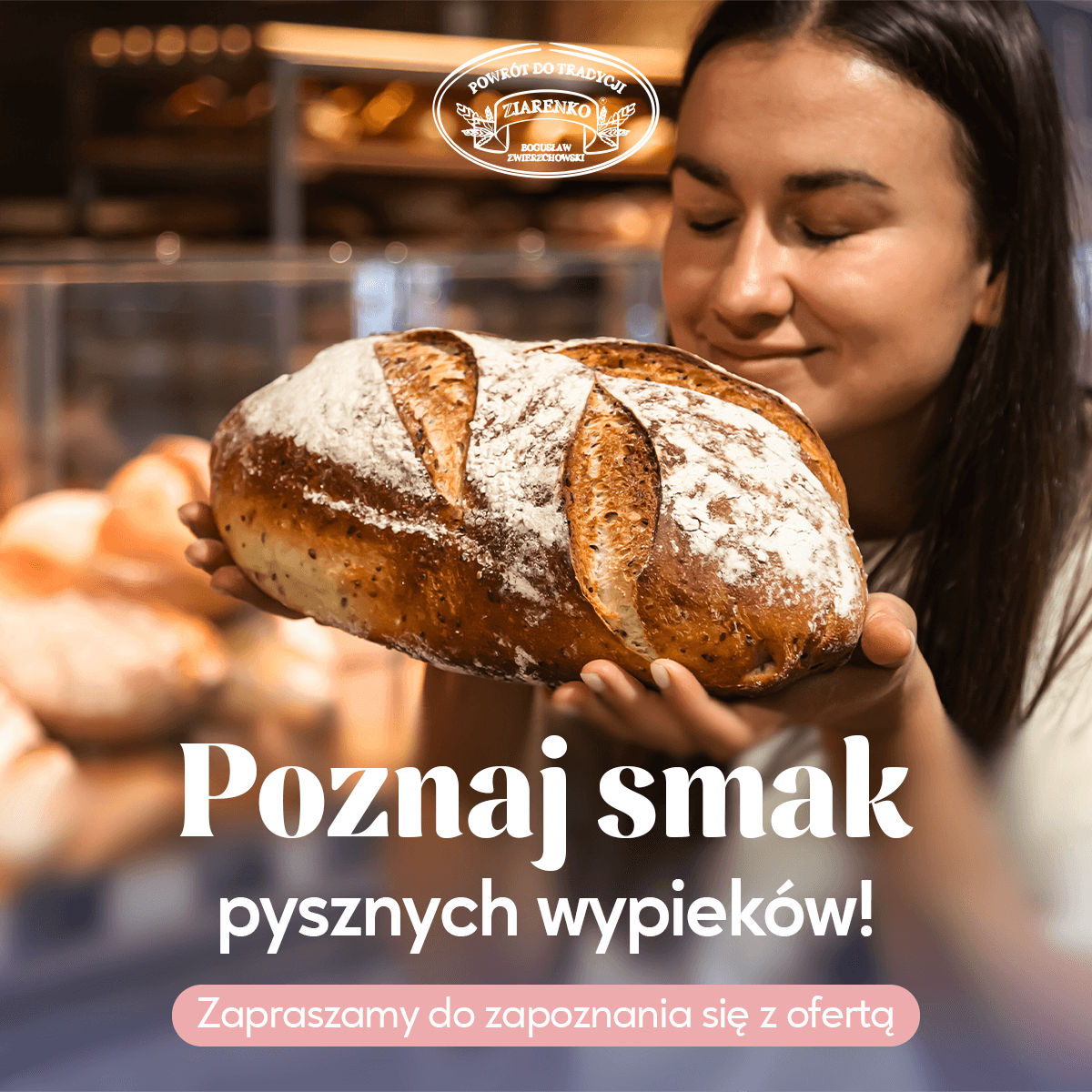
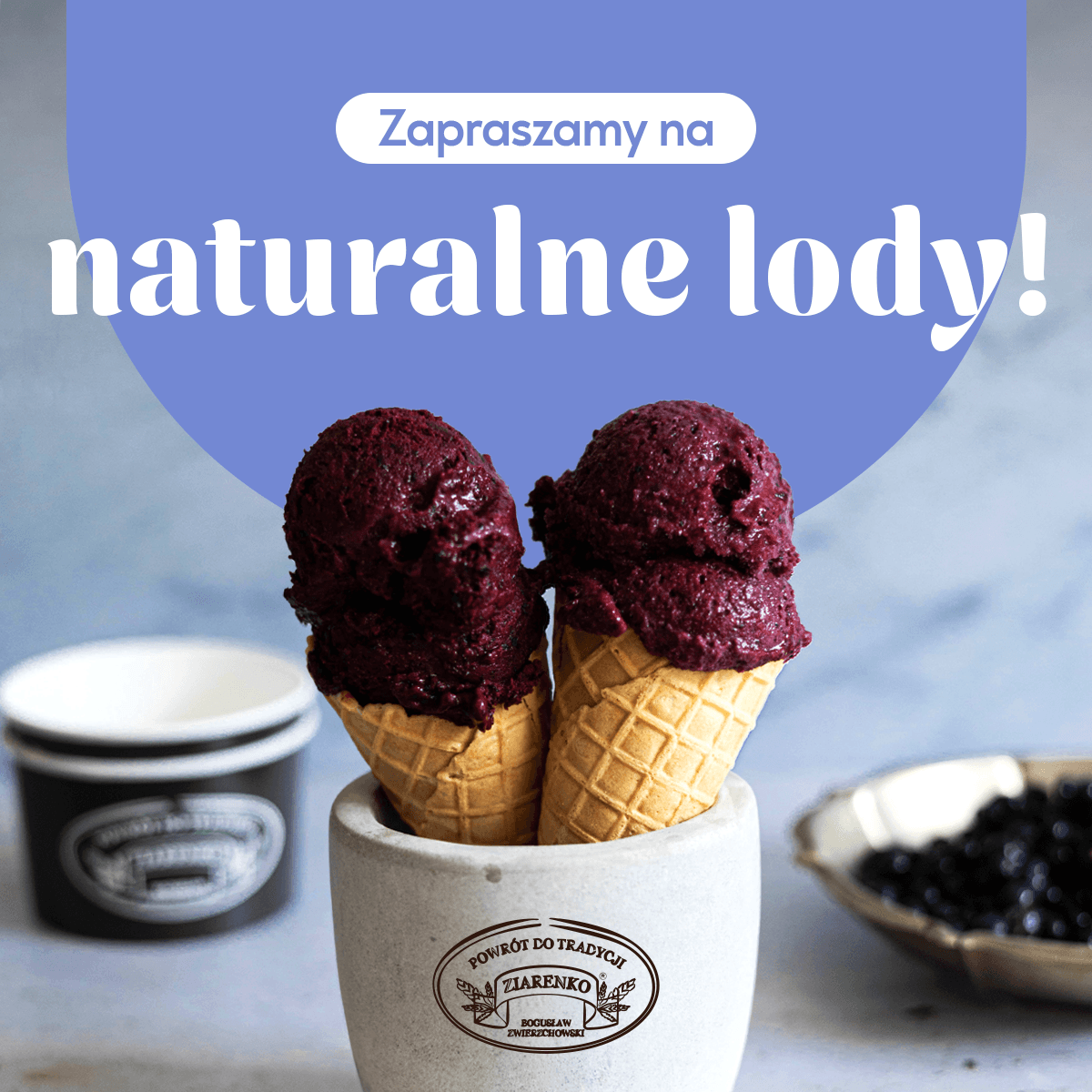
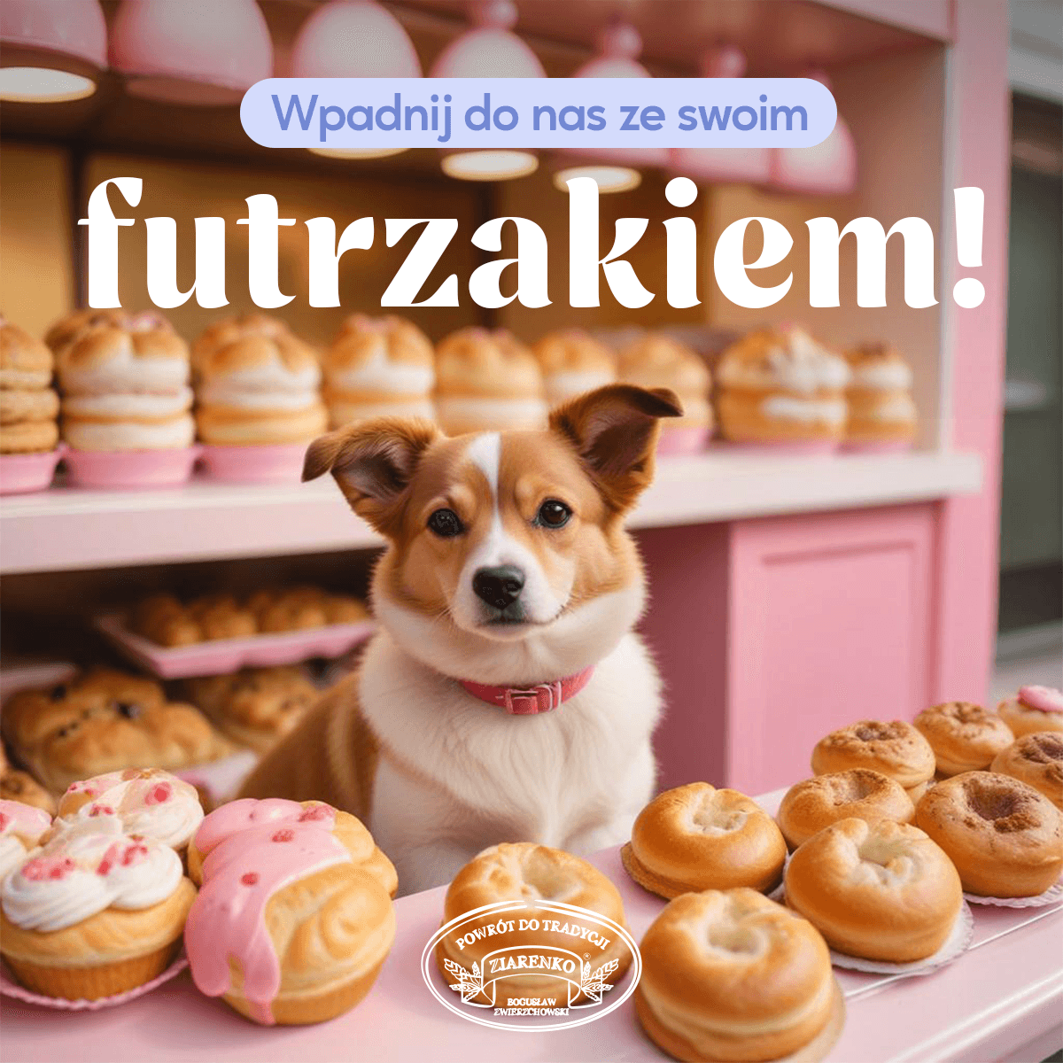
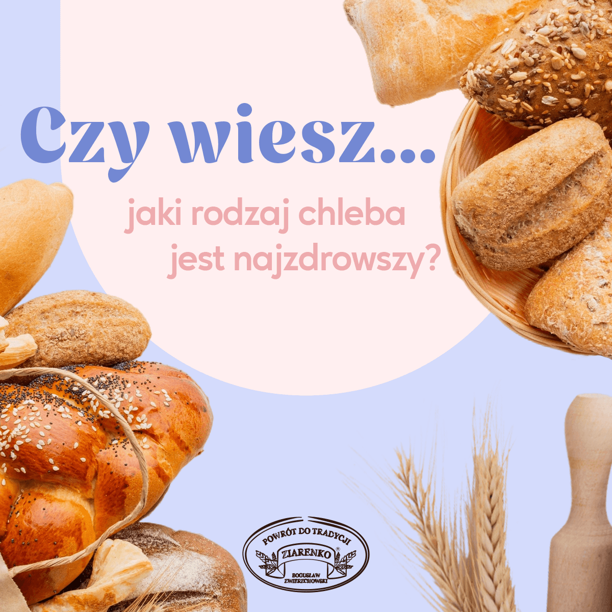
The Goal
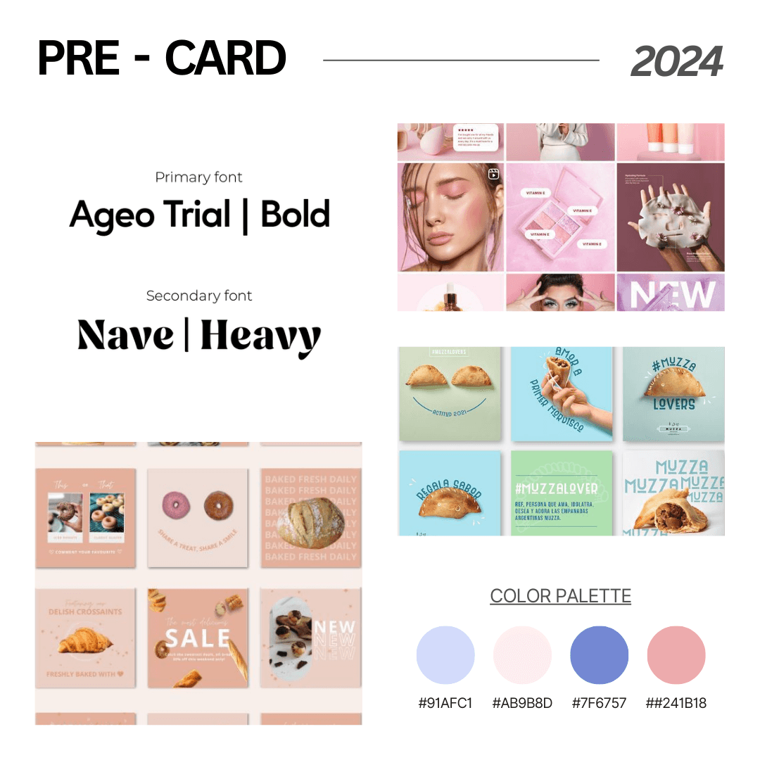
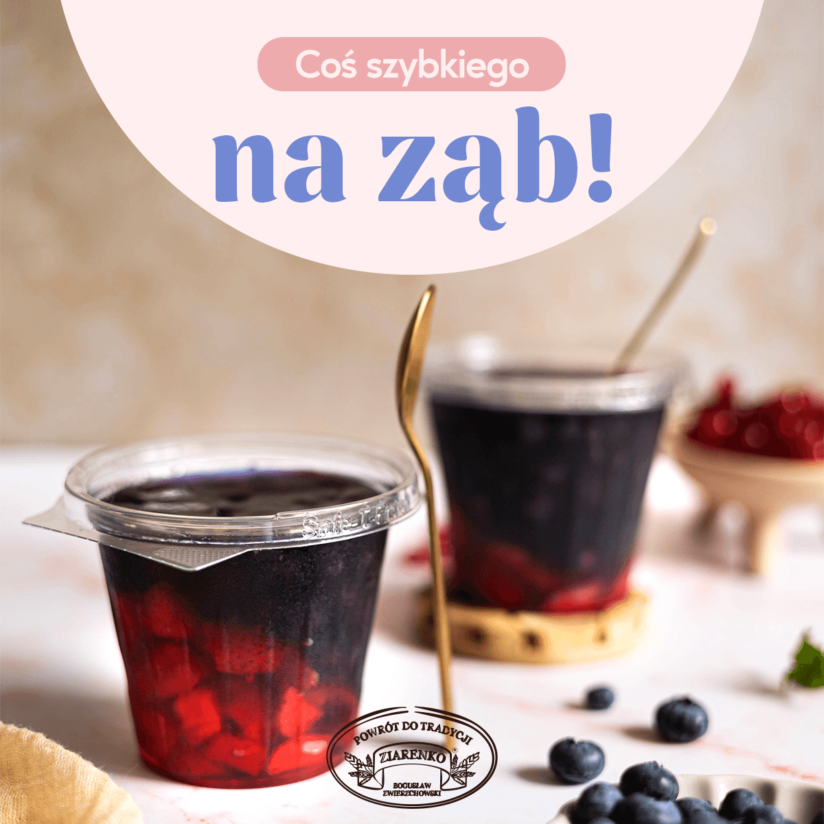
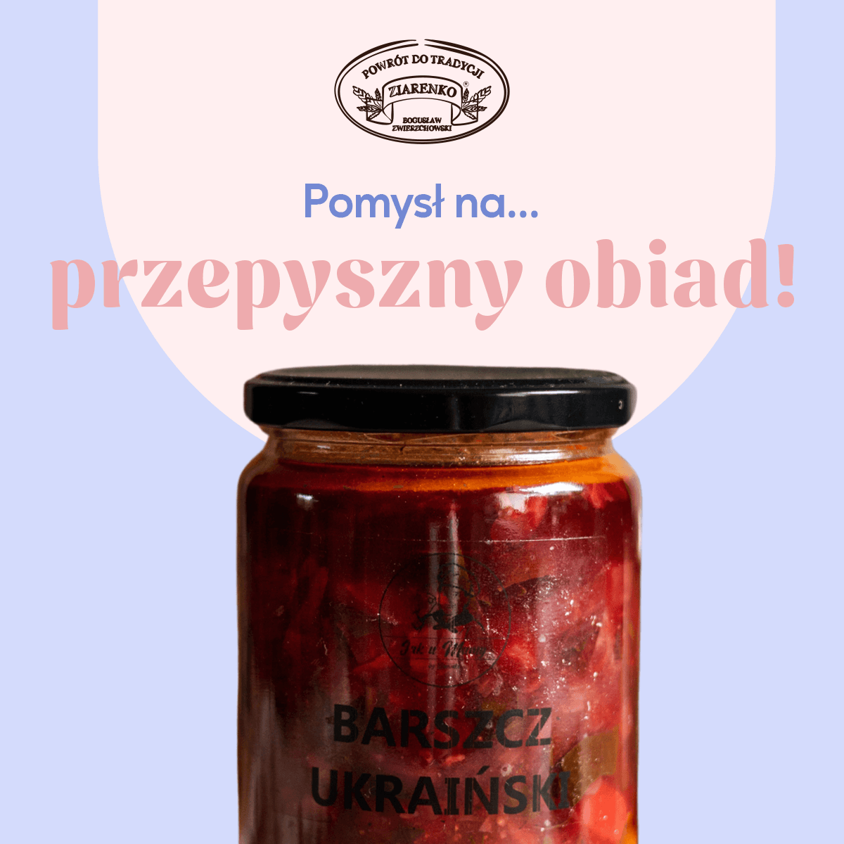
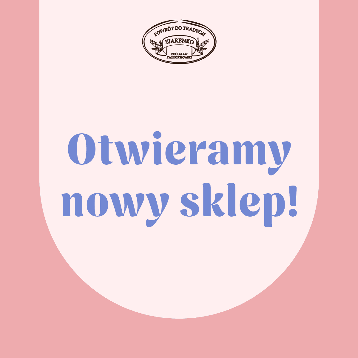
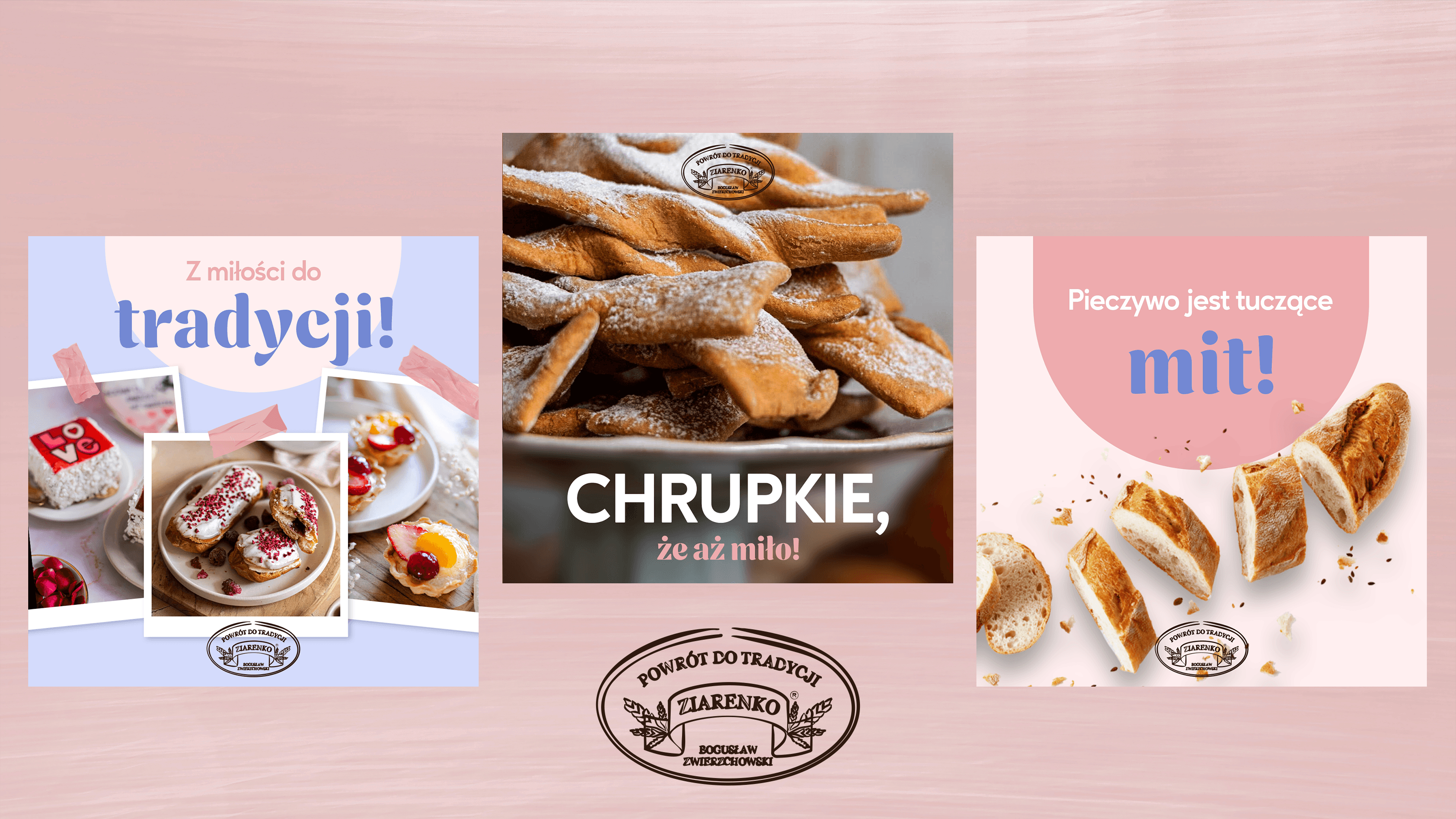
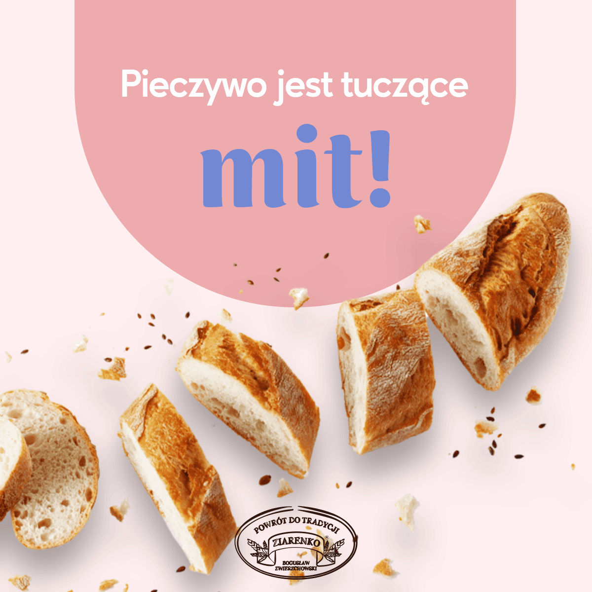
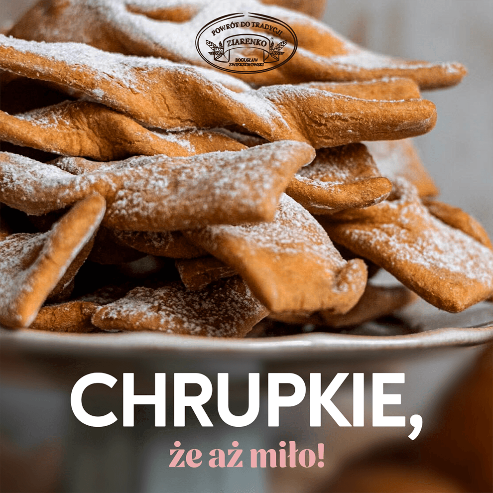
Proposed solution

Feedback and Refinement
The client's feedback was overwhelmingly positive. They were particularly pleased with the consistent communication throughout the project, which made them feel fully involved in the branding process, just as they had hoped. The design met their expectations perfectly, with the color palette being their favorite aspect. The client described the palette as "like a delicate strawberry cream," expressing their satisfaction with the overall aesthetic.