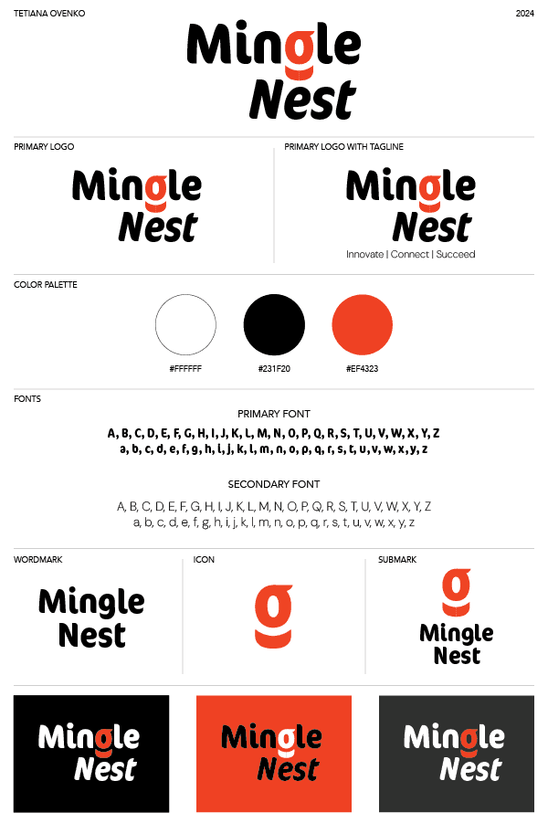
Mingle Nest Logo
Branding
2024
Purpose/Concept
The goal of this project is to create a logo that clearly reflects the essence and values of the IT company. The main concept is to develop a recognizable visual identity that combines simplicity, professionalism, and a modern approach. The logo should be memorable and easily identifiable by clients while also conveying the company's commitment to precision and innovation.
Design
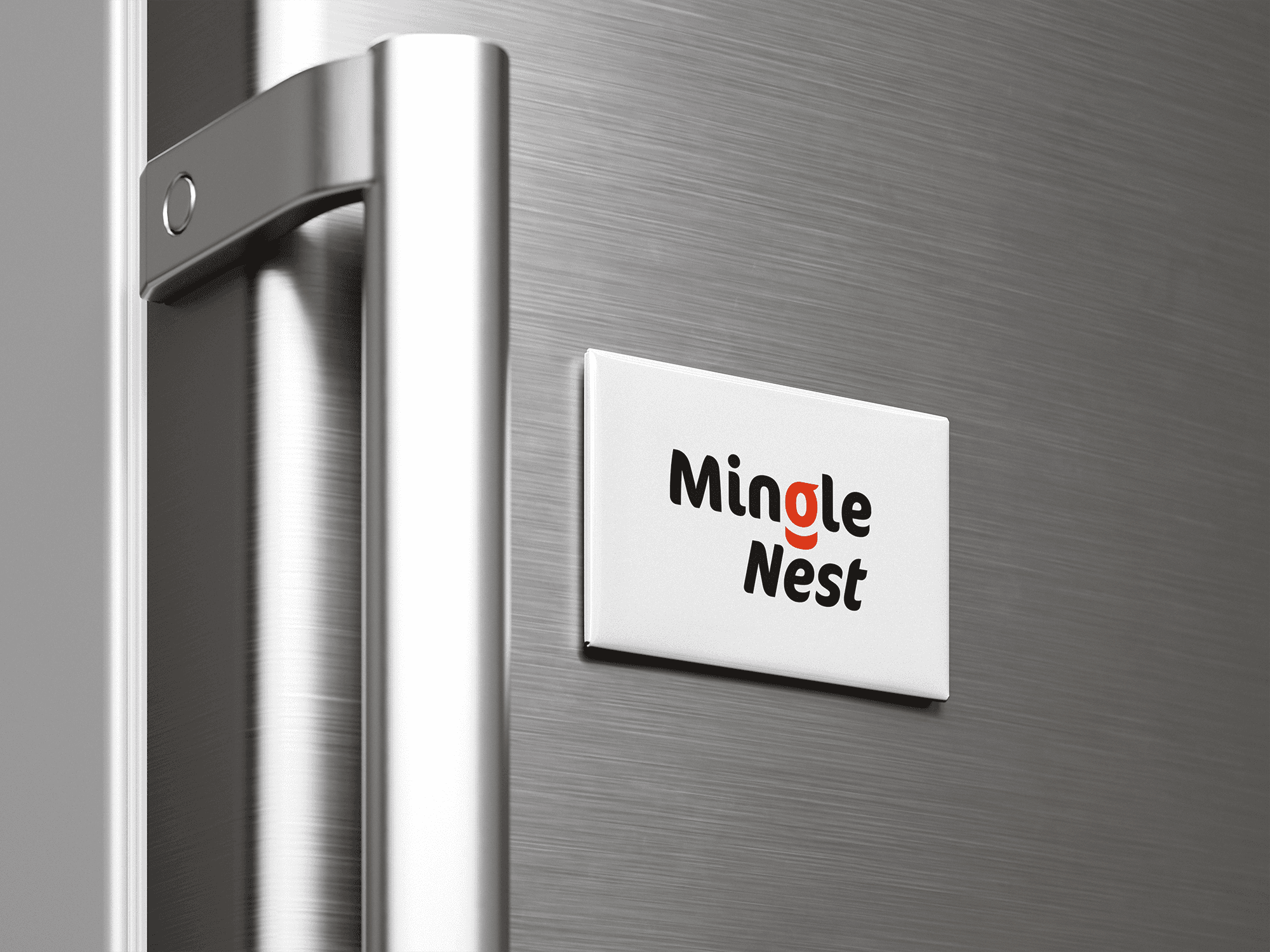
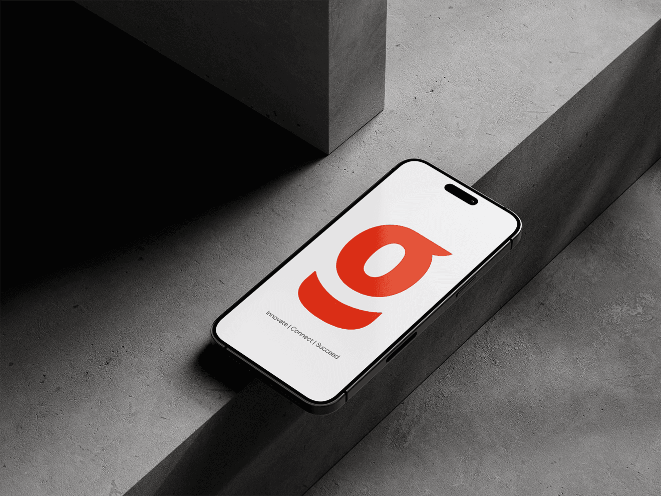
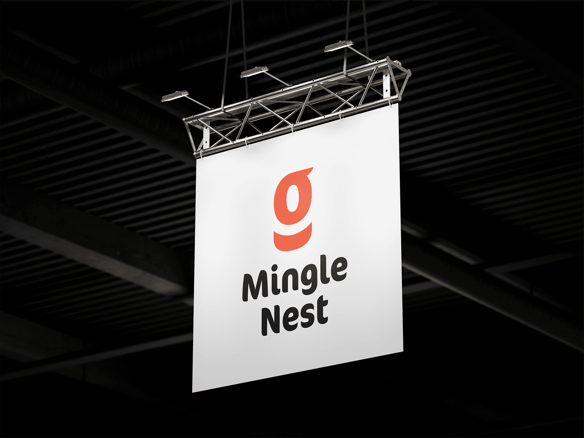
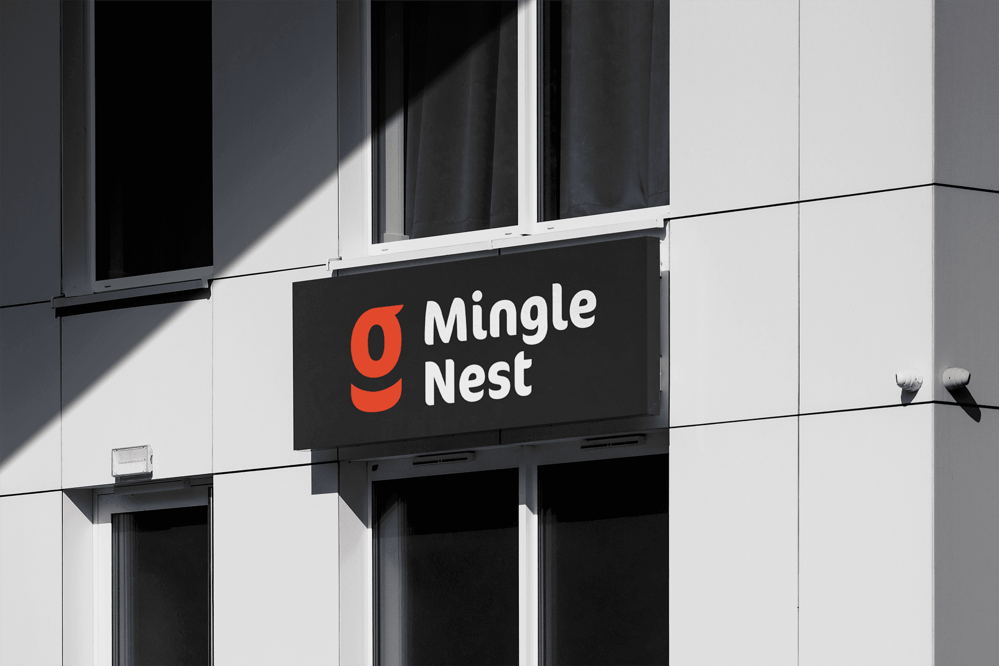
The design emphasizes minimalism and clarity, with a strong focus on authenticity and recognizability. For the text component, a simple and classic font with rounded shapes was selected to convey a sense of approachability. The sharp edges of the font add a touch of precision, aligning with the detailed nature of the IT field.
The icon serves as the central focus of the design. Its shape is intentionally kept simple to ensure easy recognition and memorability. The vibrant orange color injects a dynamic element, capturing attention and adding energy to the logo. Additionally, the design is highly flexible, allowing for adjustments in the arrangement, size, and colors of the elements without losing the logo's authentic character.